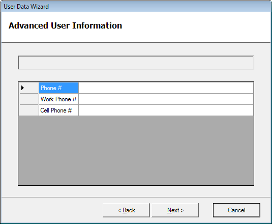
In this post, I’d like to take a step back and consider a fundamental design question: do we really need wizards? Here’s what Alan Cooper et. al. write about wizards in their monumental tome on user interaction design, About Face 3:
Wizards are an idiom unleashed on the world by Microsoft… they are a fine example of interrogation tactics on the program’s part, and violate the design principle: Provide choices, don’t ask questions… The user is like the conductor of a robot orchestra, swinging the baton to set the tempo but otherwise having no influence on the proceedings…. A better way to create a wizard is to make a simple, automatic function that asks no questions of users but that just goes off and does the job… Wizards were purportedly designed to improve user interfaces, but they are, in many cases, having the opposite effect.
About Face 3 (561-562), Alan Cooper et. al., 2007 Wiley Publishing, Inc.
Wow! That’s quite a searing indictment. But is it accurate? I can’t help but wonder if Mr. Cooper does his own taxes. Probably not… Because if he had, and if he used any popular tax preparation product, such as TurboTax or TaxCut, what he would see is a essentially a spiffed-up wizard. And I would imagine his life (and countless others) would be quite miserable should those programs use any other paradigm.
Of course, he does have a point… it’s quite easy to overuse or misuse the wizard paradigm (and Merlin makes it even easier ;-)). For tasks such as creating a new PowerPoint presentation, an example Cooper uses in his text, a Wizard is in fact superfluous. Just let the application create a new document as it sees fit, and let the user make the changes. So when is it a good idea to use a wizard after all?
The following are some of the indicators that a wizard is called for:
- A task must be broken down. That is, when the task performed is too immense for a user to consider in one step. The tax computation example easily comes to mind.
- Asking for forgiveness is not an option. In other words, it’s not possible to do the job first and then let the user make changes. An easy example of this is the installer. It doesn’t make sense to install the application first and only then to ask which directory it should be installed into, whether or not certain files should have been overwritten, whether some component should not have been installed at all, etc. Similarly, we wouldn’t want our tax programs to just pre-fill the 1040 form with last year’s data and make us go through the completed IRS form making adjustments.
- The user’s attention must be directed. If instead of a wizard we give the user one big jolly tabbed window with options speckled throughout, we have no guarantee that the user will set or even see these options. If sensible defaults are available and the options can be changed later, that’s not a problem. However, if the options presented must be brought to the attention of the user, or if some data must be collected, a Wizard is a preferable way.
- It is not known in advance which sections are relevant. At some point in a TurboTax or TaxCut sequence, the application will ask if you have received a 1099-INT form or have interest to report. If you have not and do not, it will not offer you to enter that data. Now imagine this working with any other paradigm. Either visual elements will be appearing and disappearing as the “have 1099-INT” setting is toggled, or they will be disabled and enabled. GUI users are not accustomed to having visual elements manipulated except by their direct command. Harder still will be the times when the user is not sure which setting enables and disables (or hides and shows) other settings… He may spend many a minute wondering why information he just filled out suddenly vanished.
Long story short, the wizard as an idiom is no more great or poor than the icon, the toolbar, or a hyperlinked table of contents. As Cooper and friends themselves proselytize throughout their opus, we must design based the goals and needs of our users and the models that are natural to them.


